Lost Lindenberg
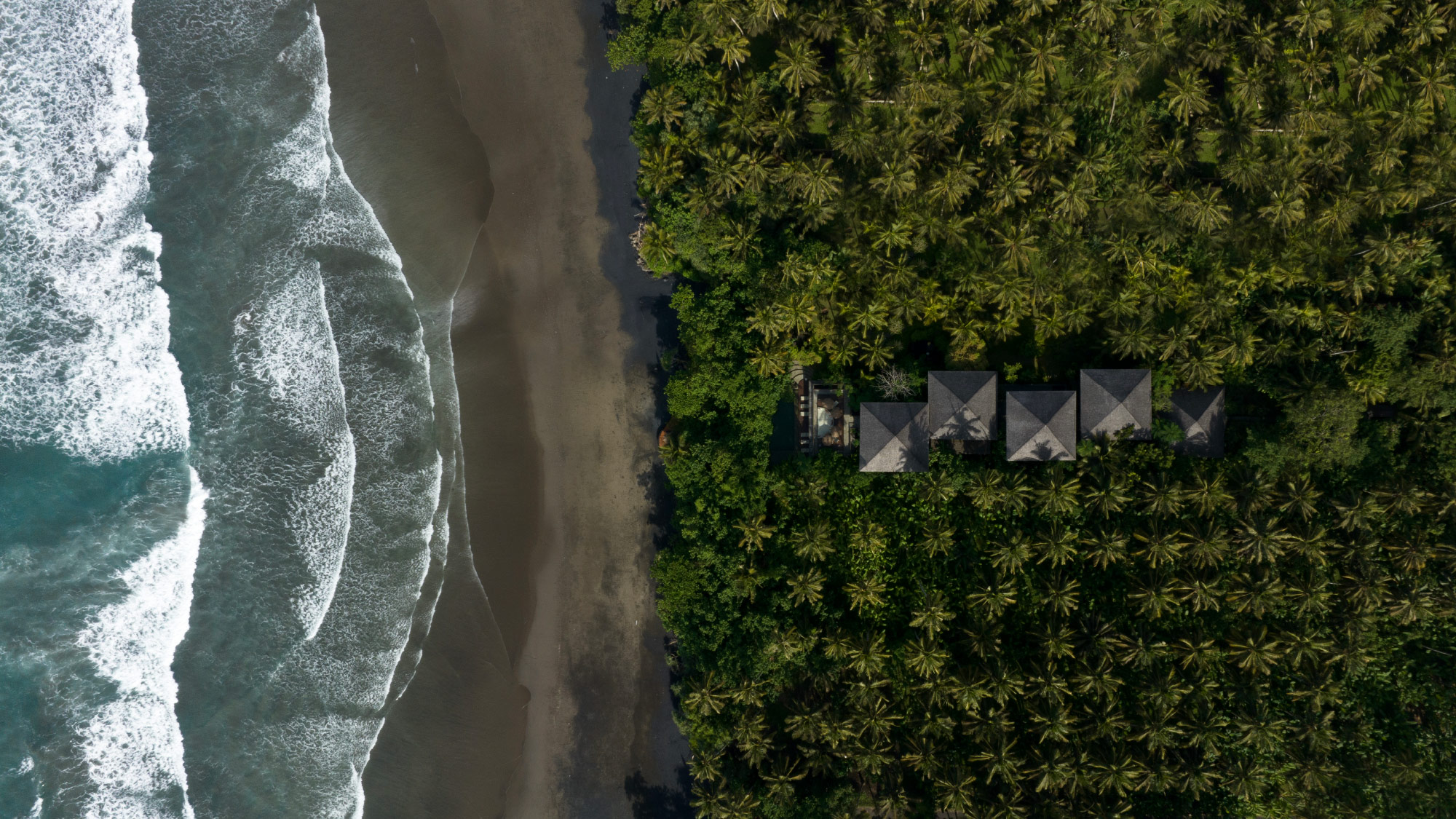
We have lost ourselves. On a deserted, black lava sand beach, in high, foaming waves, in a deep jungle of palm trees and sweet melancholic thoughts.
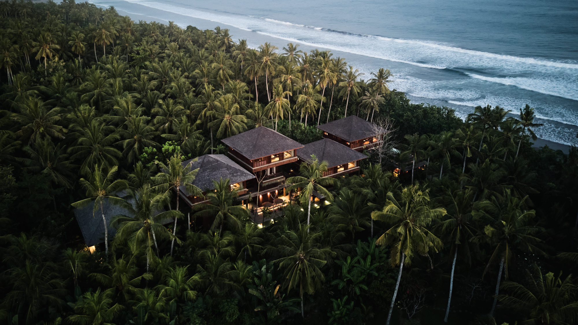
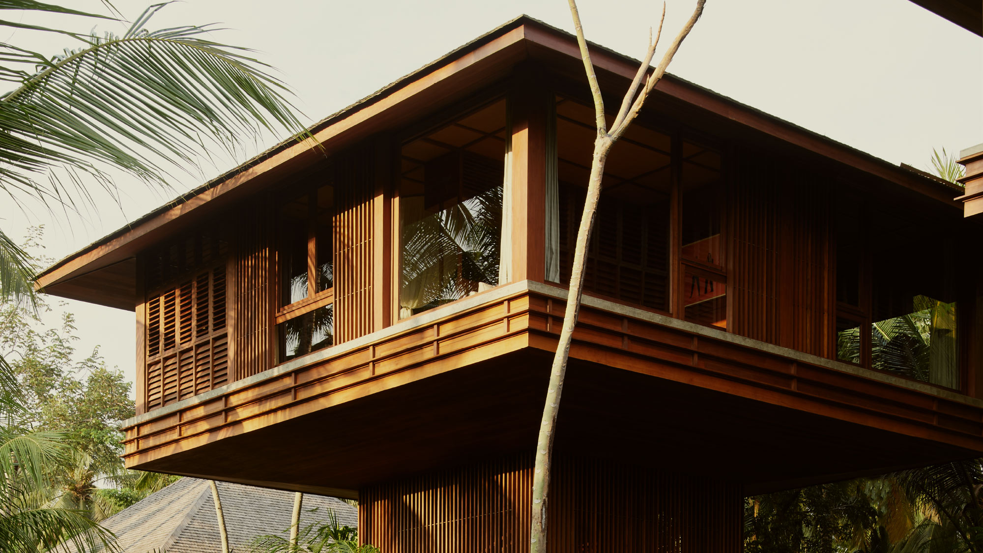
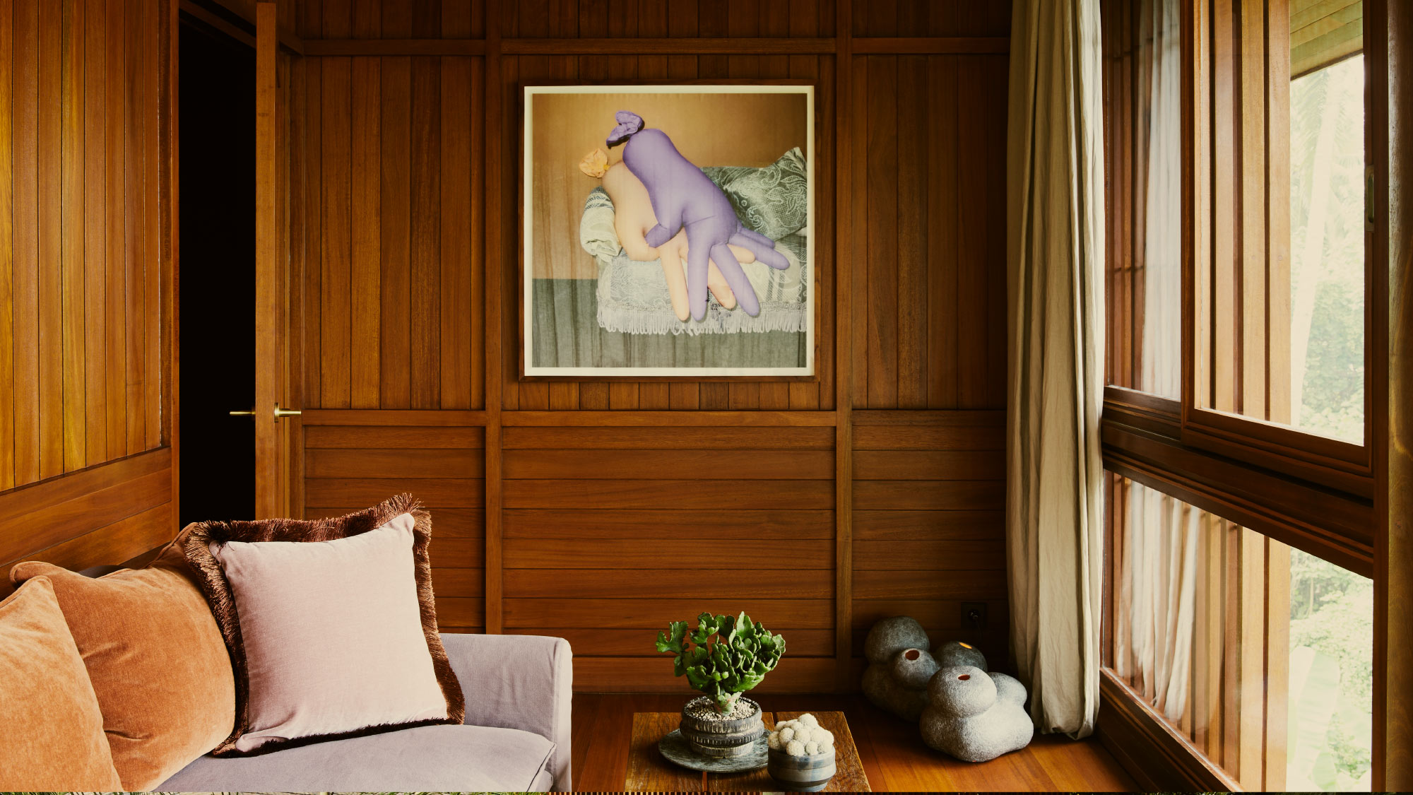
The fifth project and the first in Indonesia, from the young Frankfurt hospitality company, LINDENBERG. Just as with their previous concepts, LOST LINDENBERG focuses on the collective experience of the guests, who are invited to spend their time together in the property's communal areas. Retreat is offered in each of the eight lovingly-designed rooms, which are elevated high amongst the treetops of the West Balinese palm jungle, set on a long and pristine, glistening black lava sand beach. We designed the overall hotel identity, wayfinding, signage, and illustration concepts combining art and design. The eclectic design are combined with neon as the colour of modern and urbanity.

Bali from both perspectives
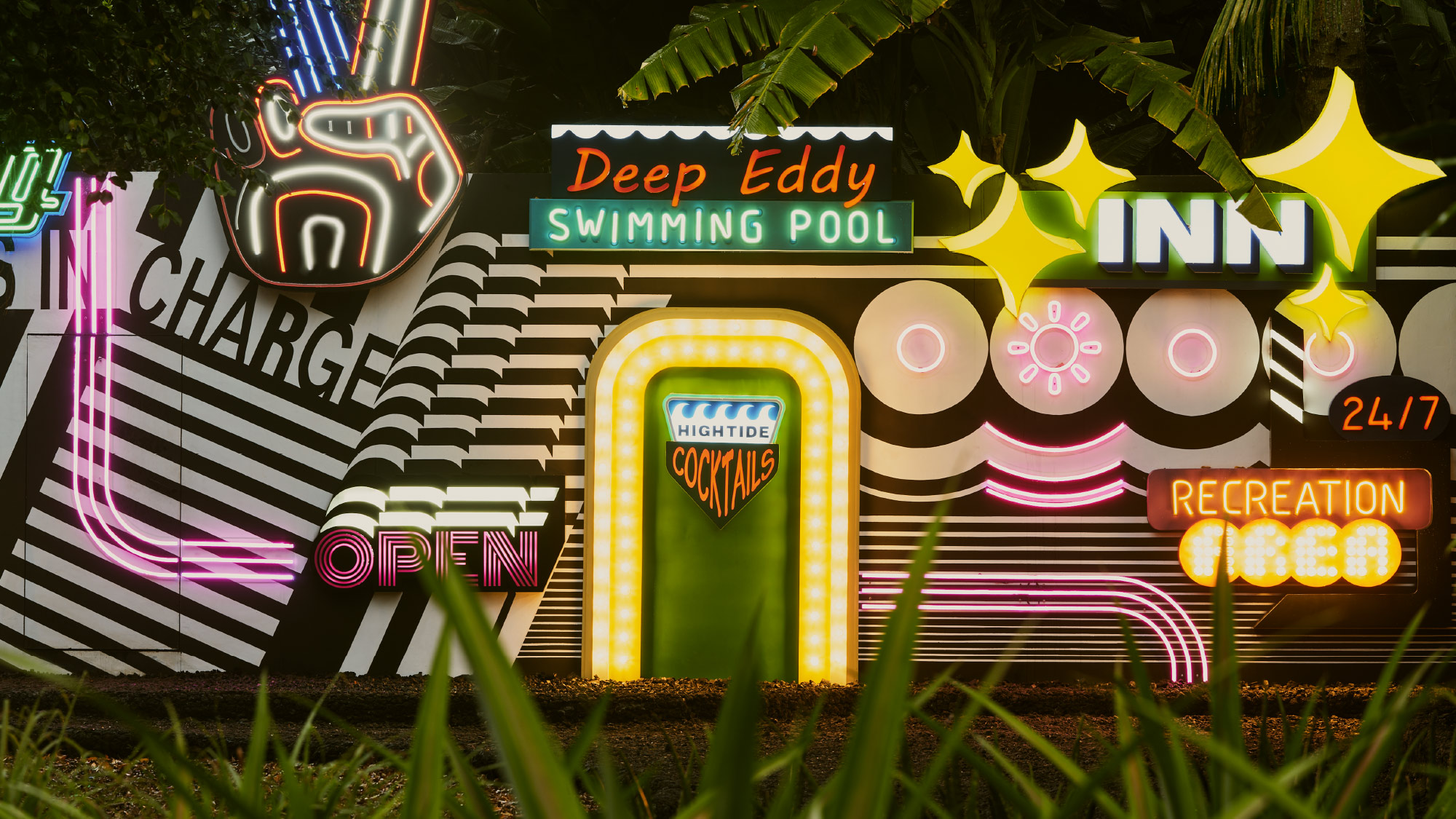
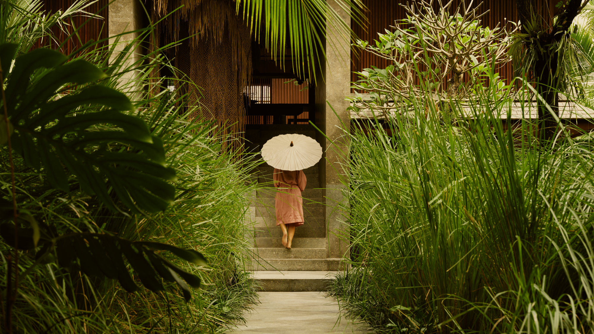
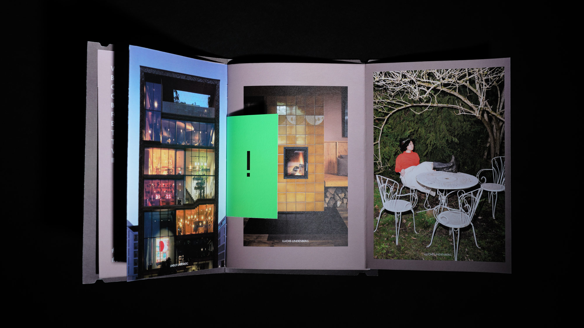
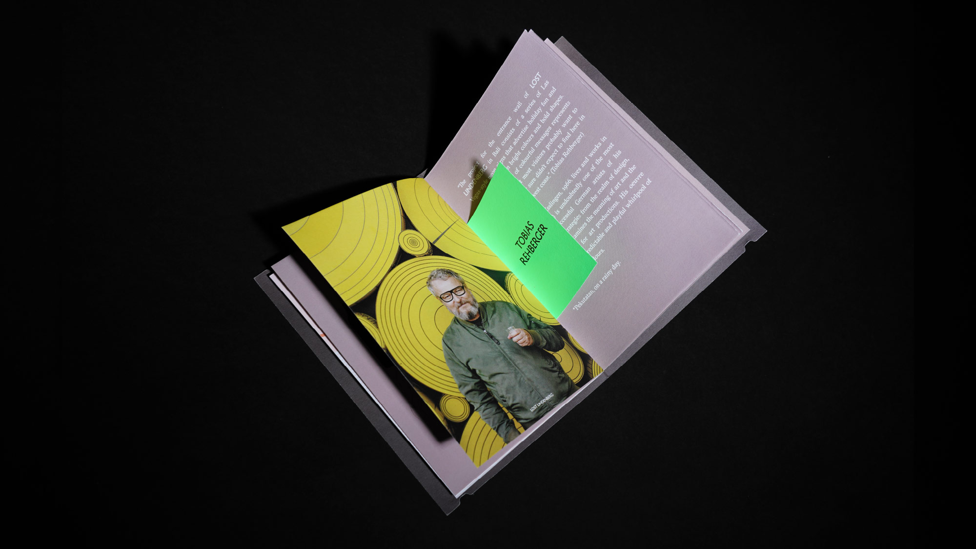
The colorful urban facade, designed by the German artist Tobias Rehberger, establishes a striking contrast with vibrant neon elements amid a deep jungle setting. The facade represents the loud side of Bali with typical holiday-esque commercialism. As guests step inside, a contrasting experience unfolds, transporting them to the quiet and mystical side of Bali. They embark on a journey through jungle-like pathways that lead them to the heart of the hotel. With views of local flora, lush jungles, ancient trees, temples, and everything that represents Bali and its natural beauty.

The Lost Boys, Colorism in Modern Fiction
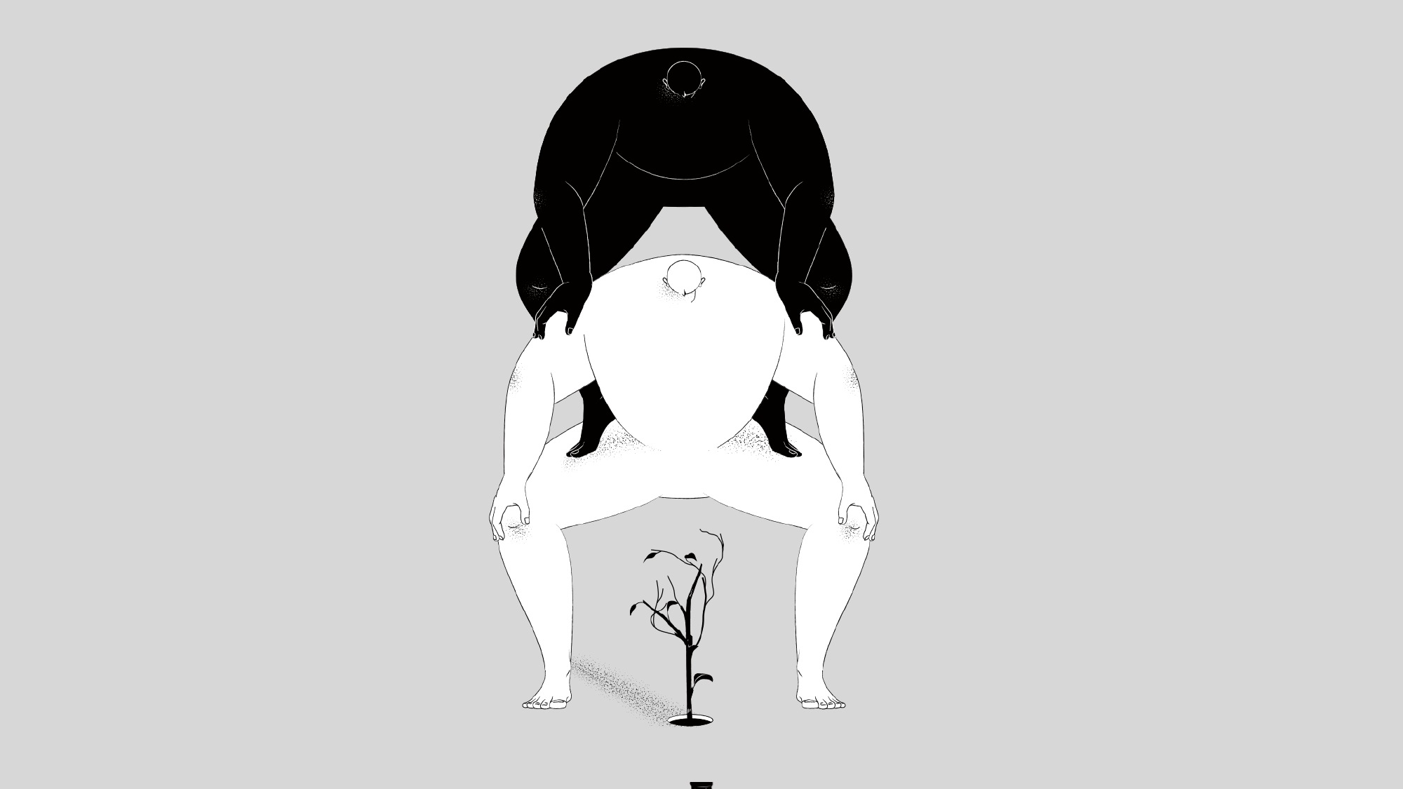
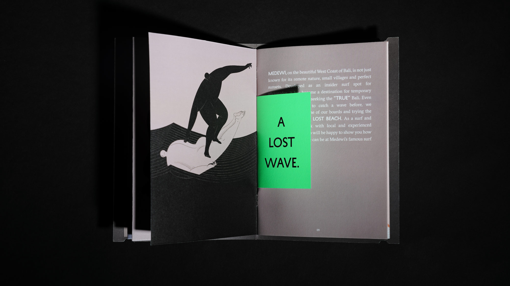
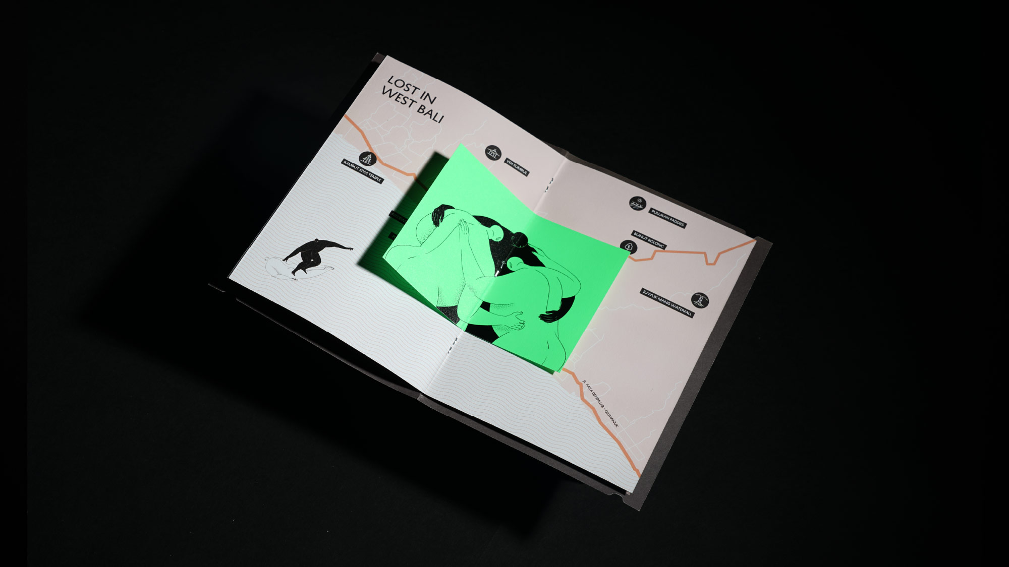
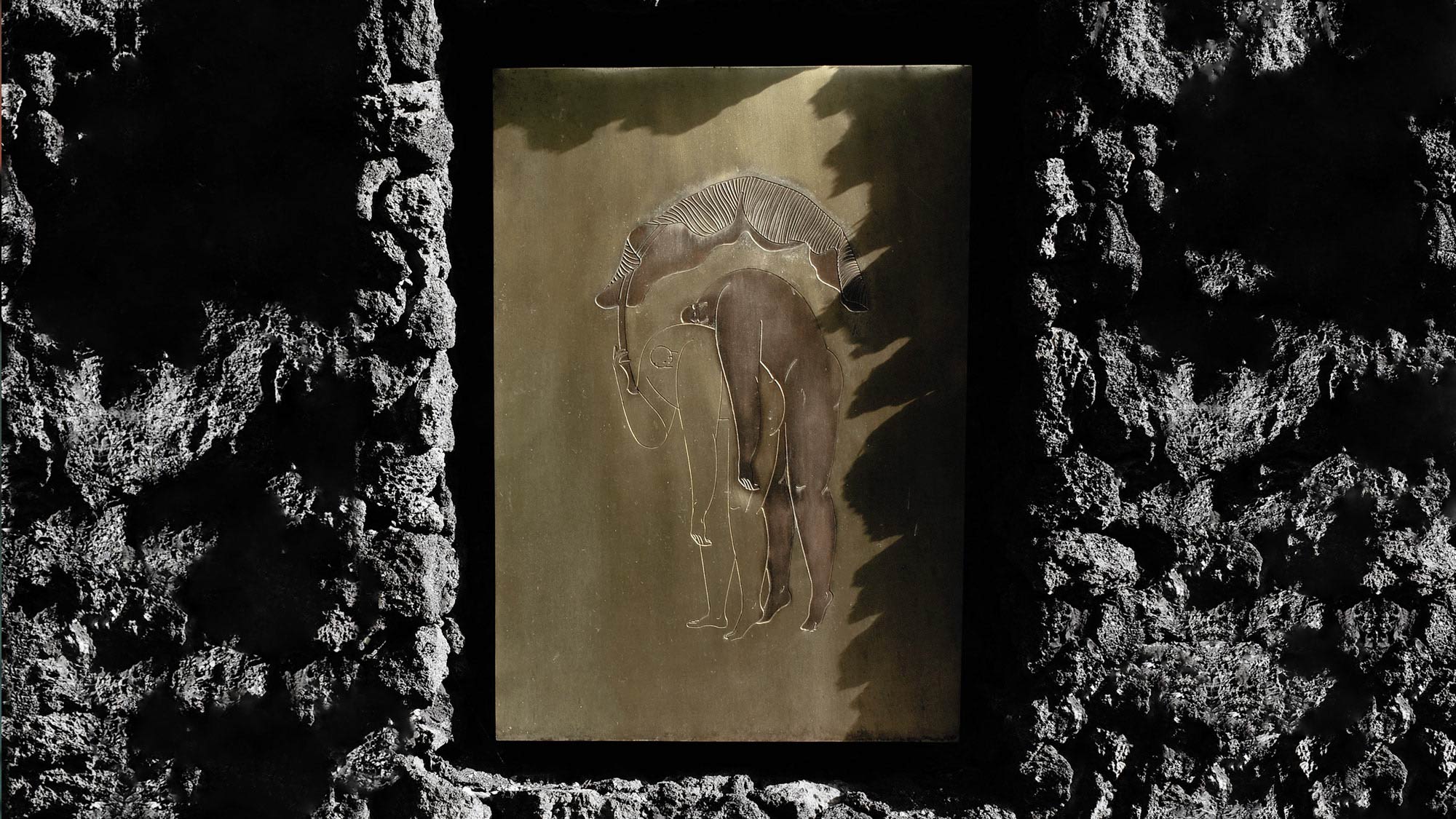
We conceived 'The Lost Boys' as a representation of Lost Lindenberg's artistic essence, symbolizing the unity of two different races working together as one. This narrative embodies the brand's artistic spirit by portraying two men consistently united, coexisting, and collaborating harmoniously despite their different skin colors. The surrealistic illustrations capture their diverse unity as they engage in various activities that epitomize the essence of Lost Lindenberg.
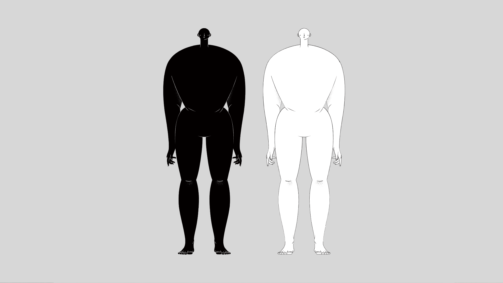
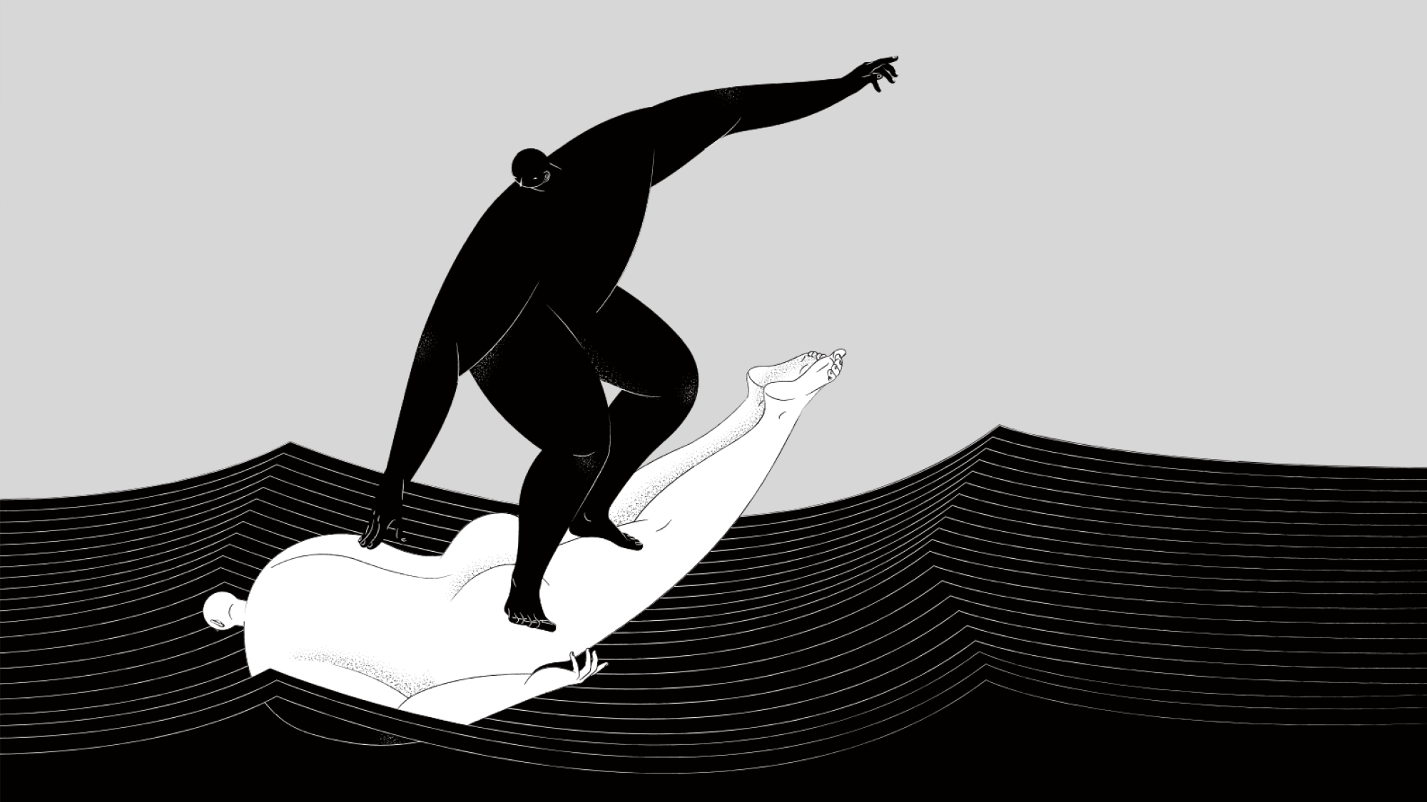
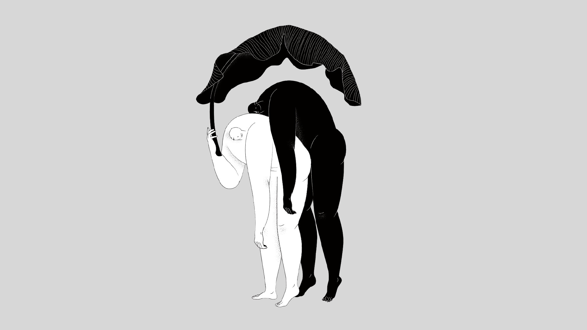
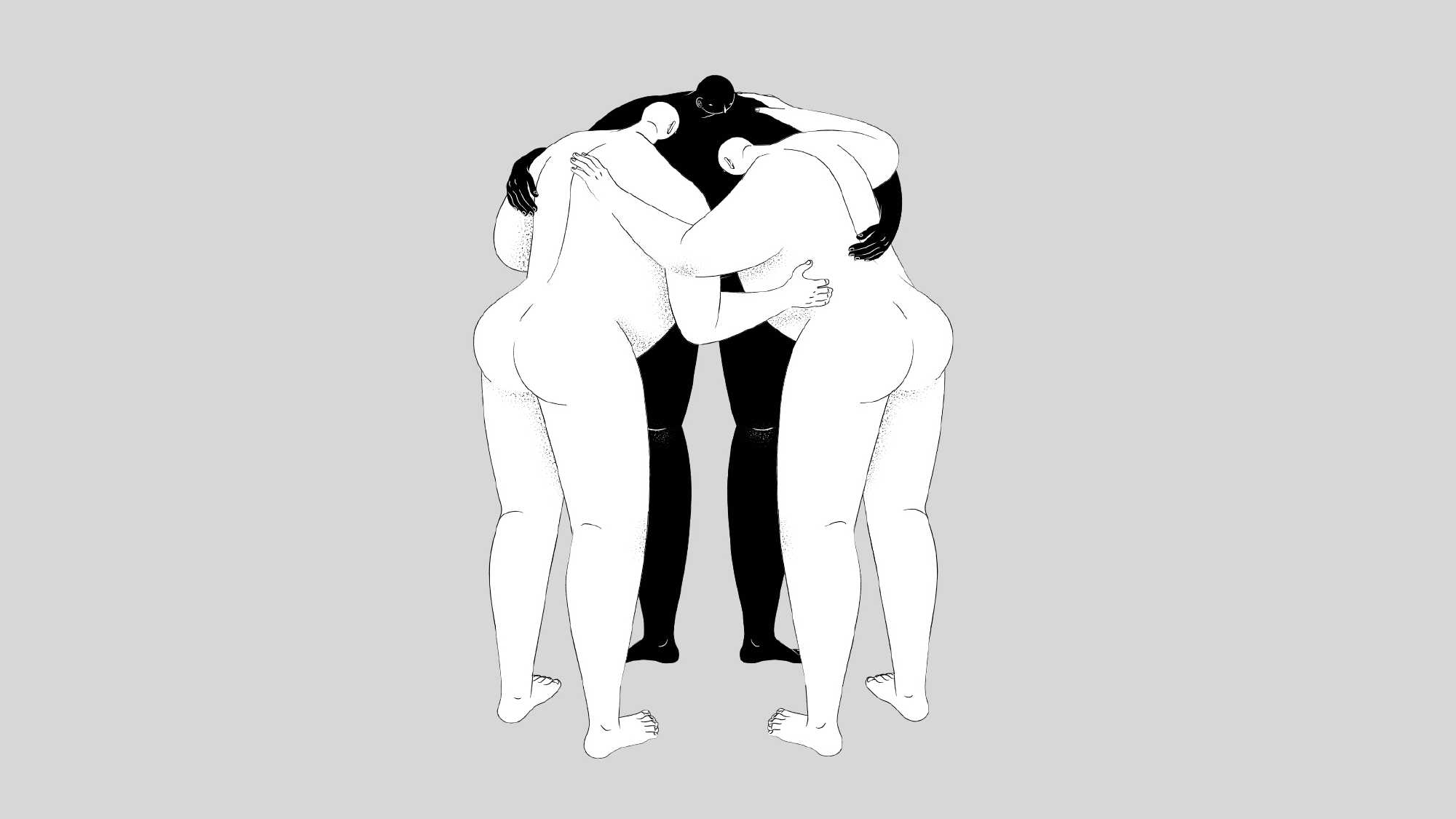
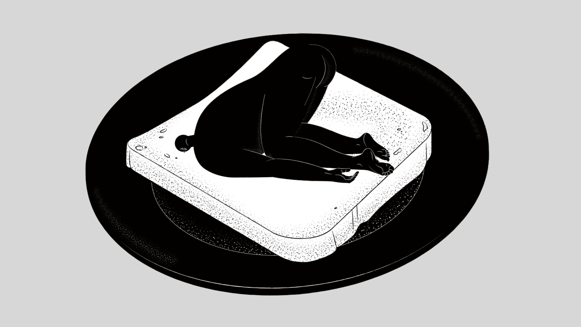
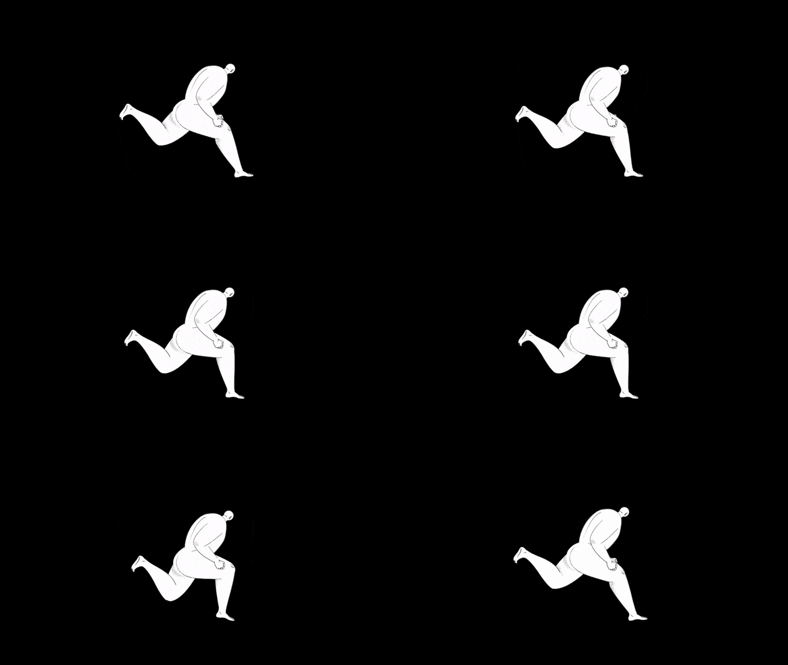
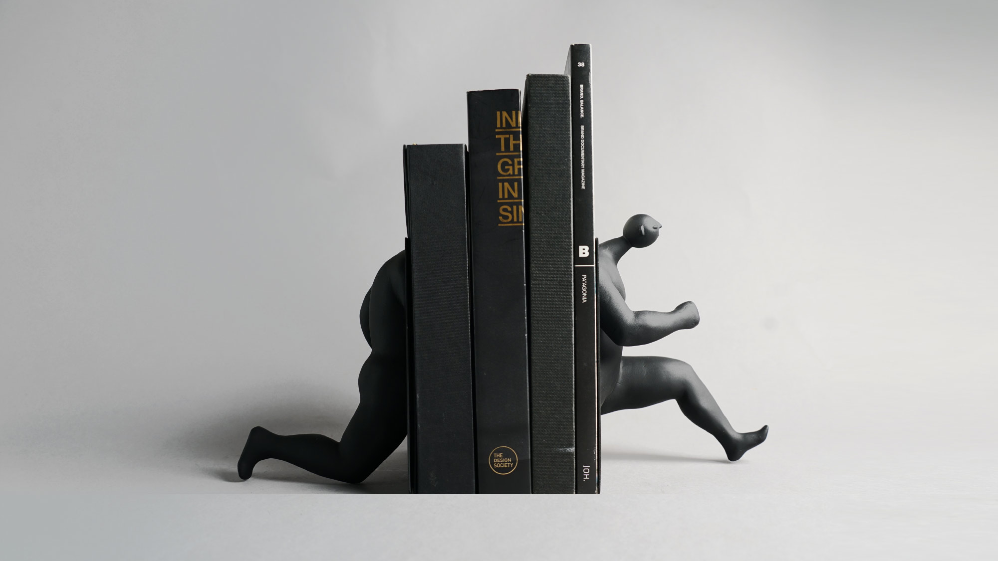
The Lost Boys are engaging in a variety of activities centered around the hotel, depicted in a wonderfully surreal manner. The essence of 'The Lost Boy' truly comes alive through merchandise and artwork, going beyond traditional illustration graphics to craft vibrant and immersive experiences that stimulate the senses.
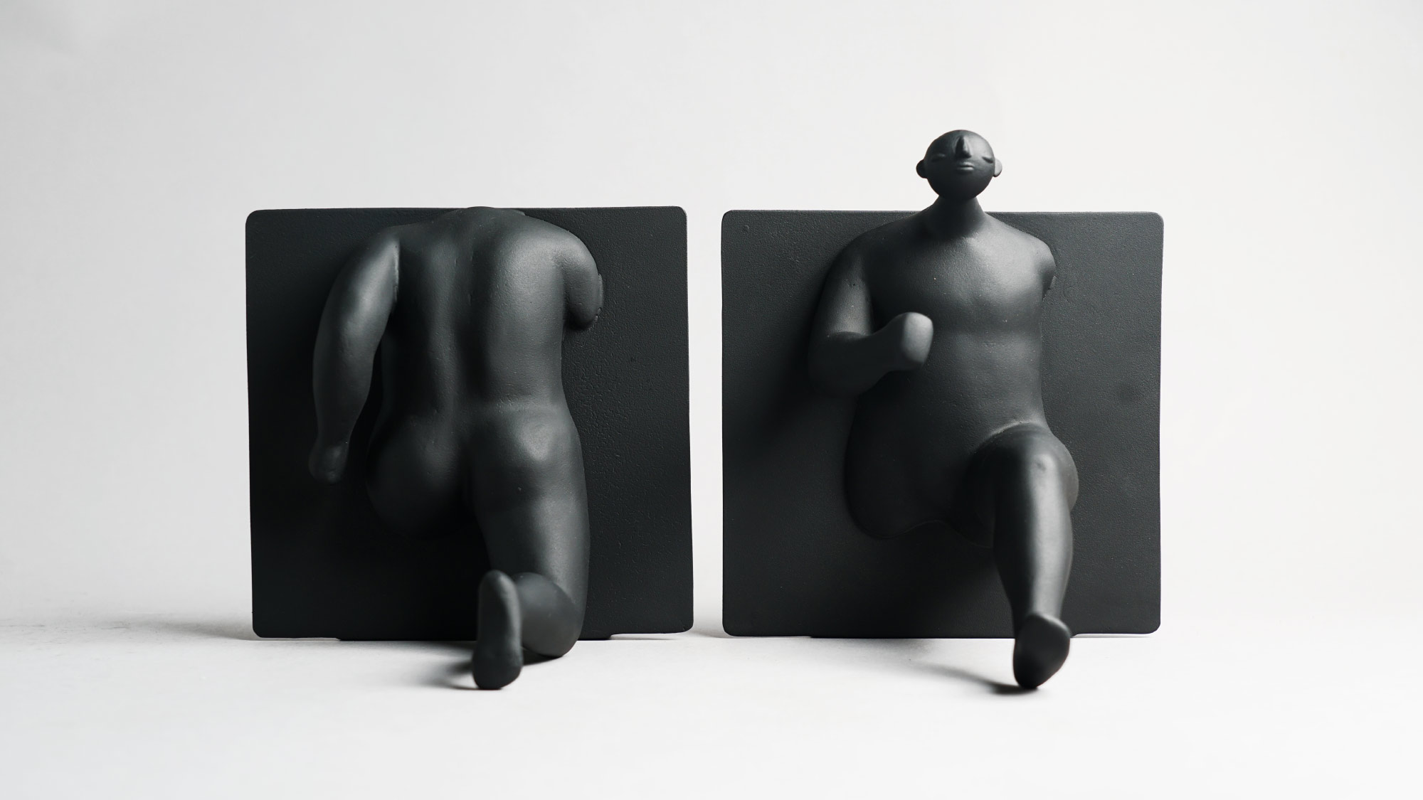

The Lost Identity
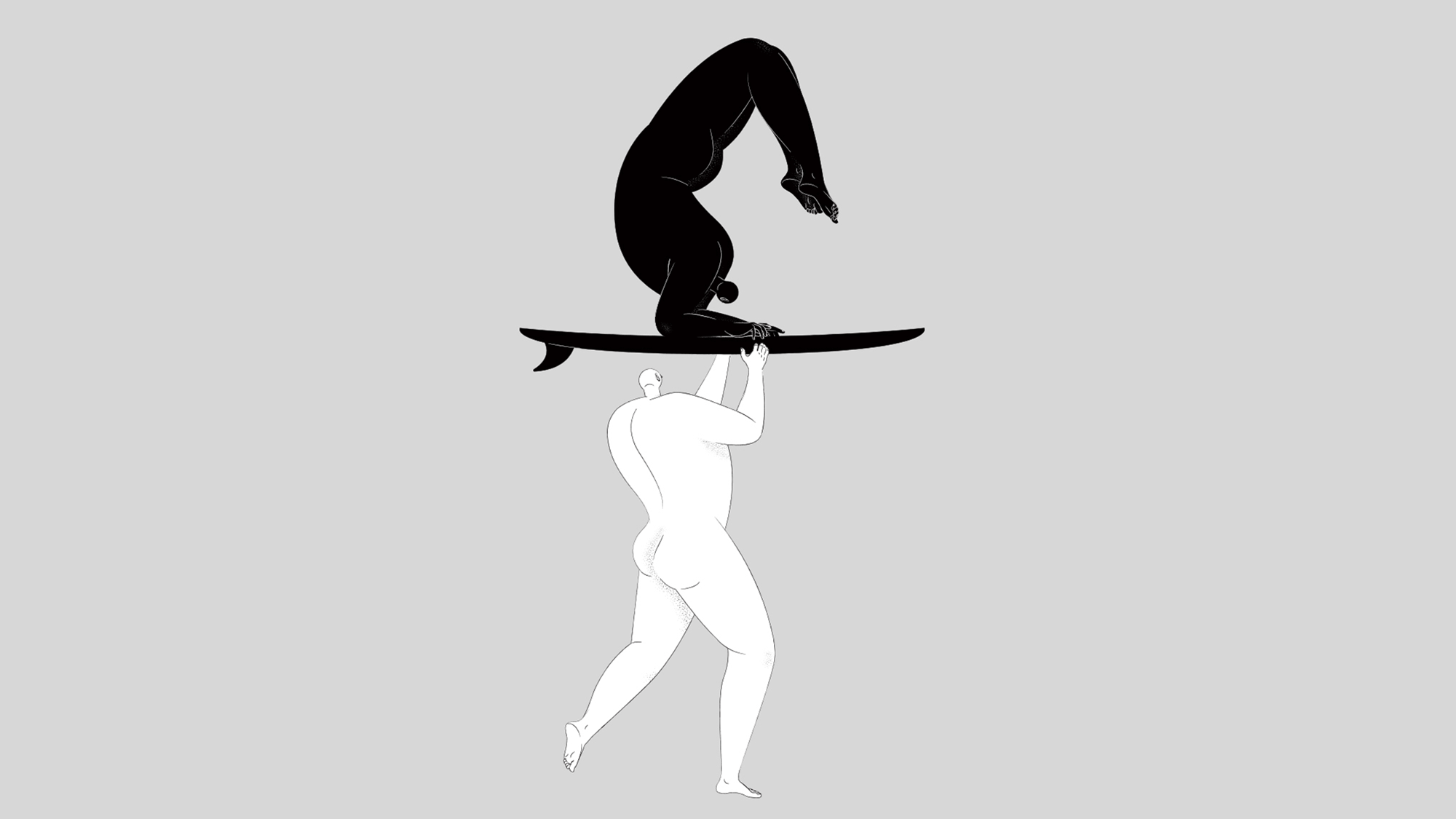
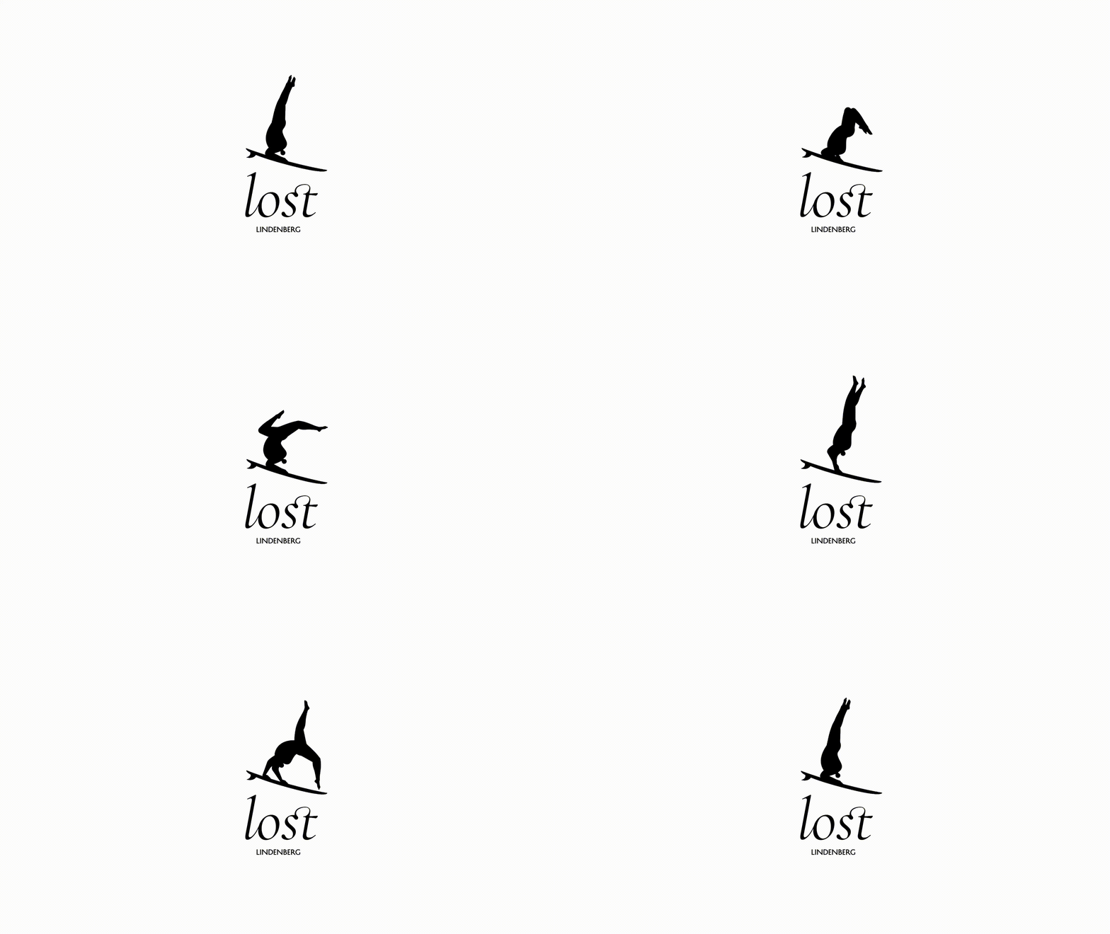
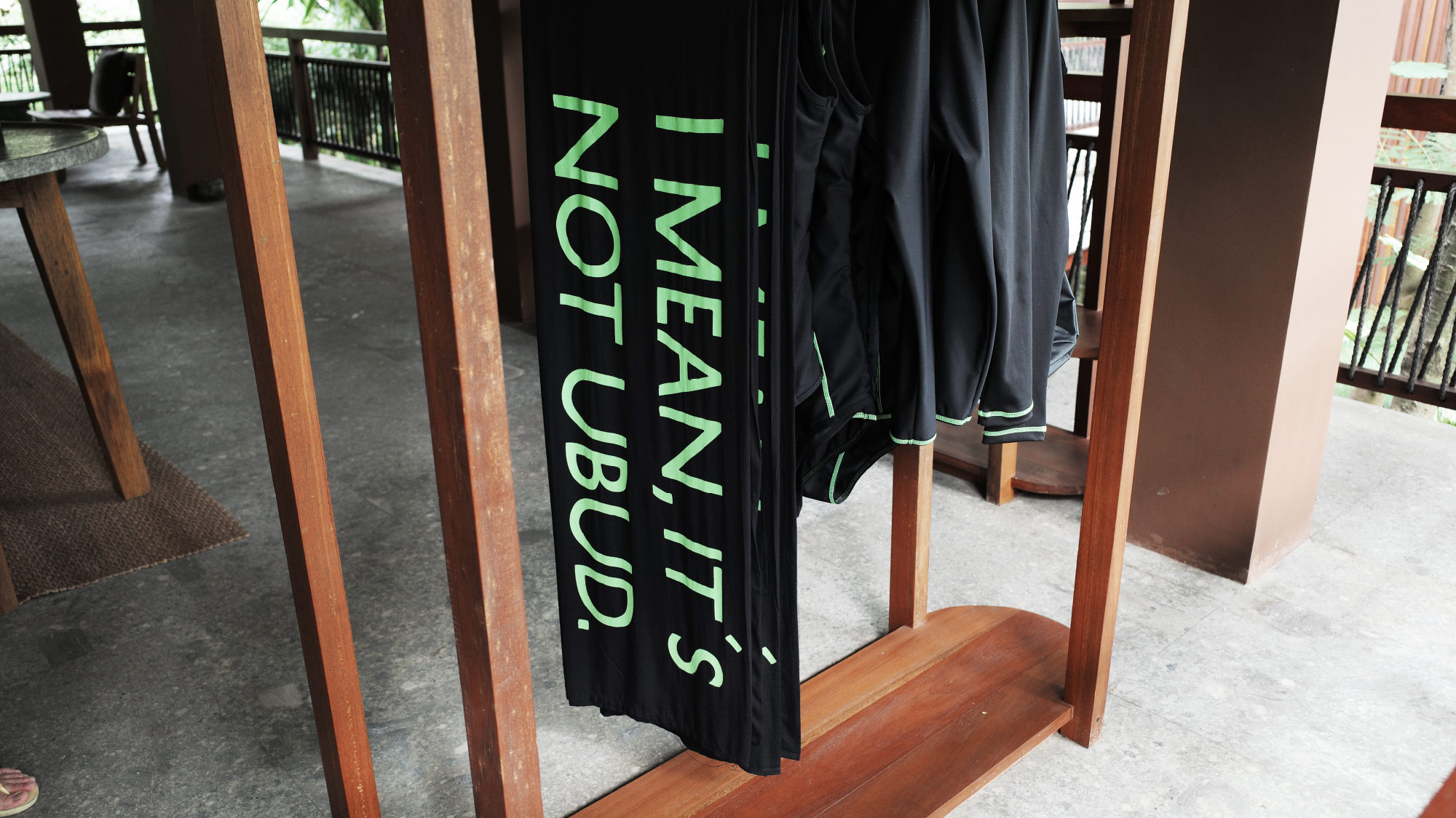
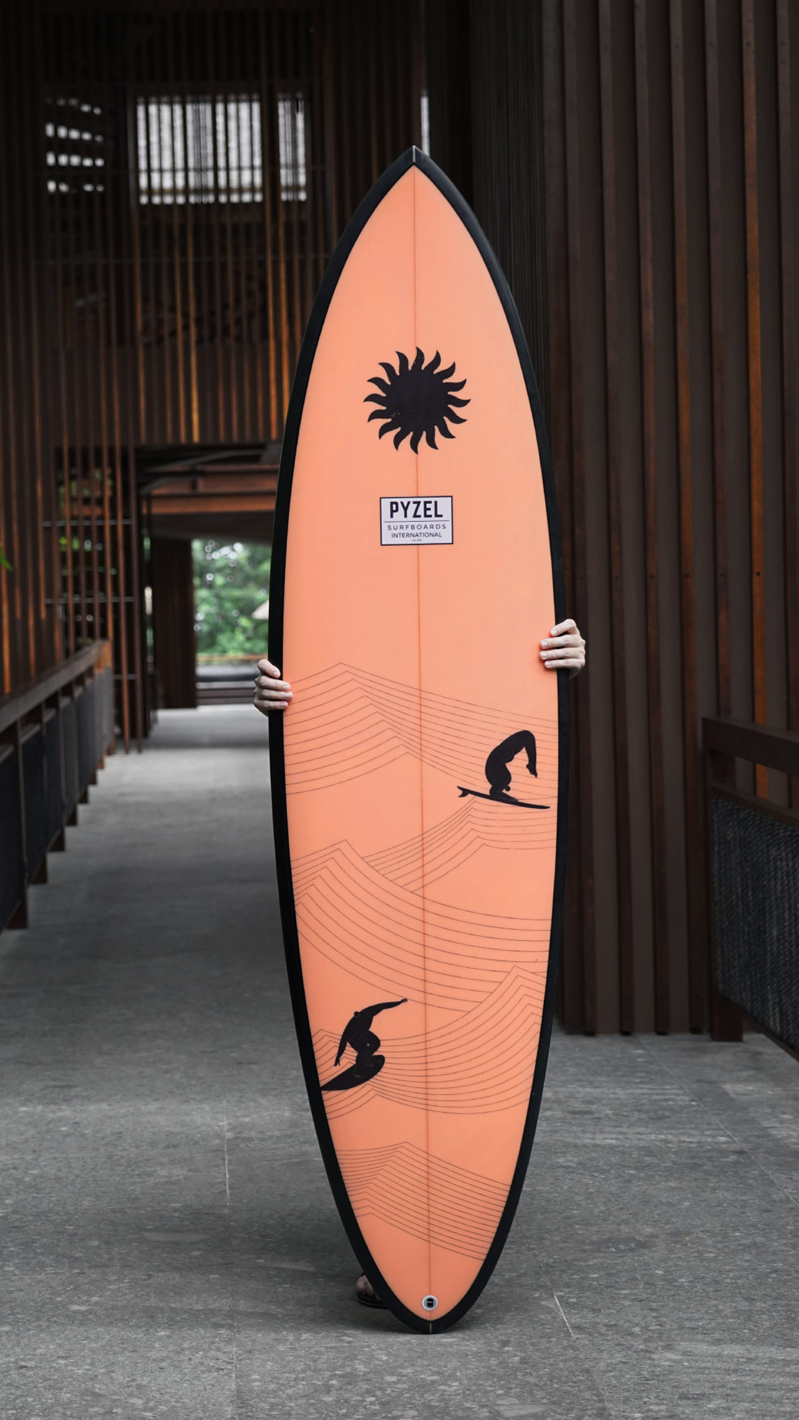
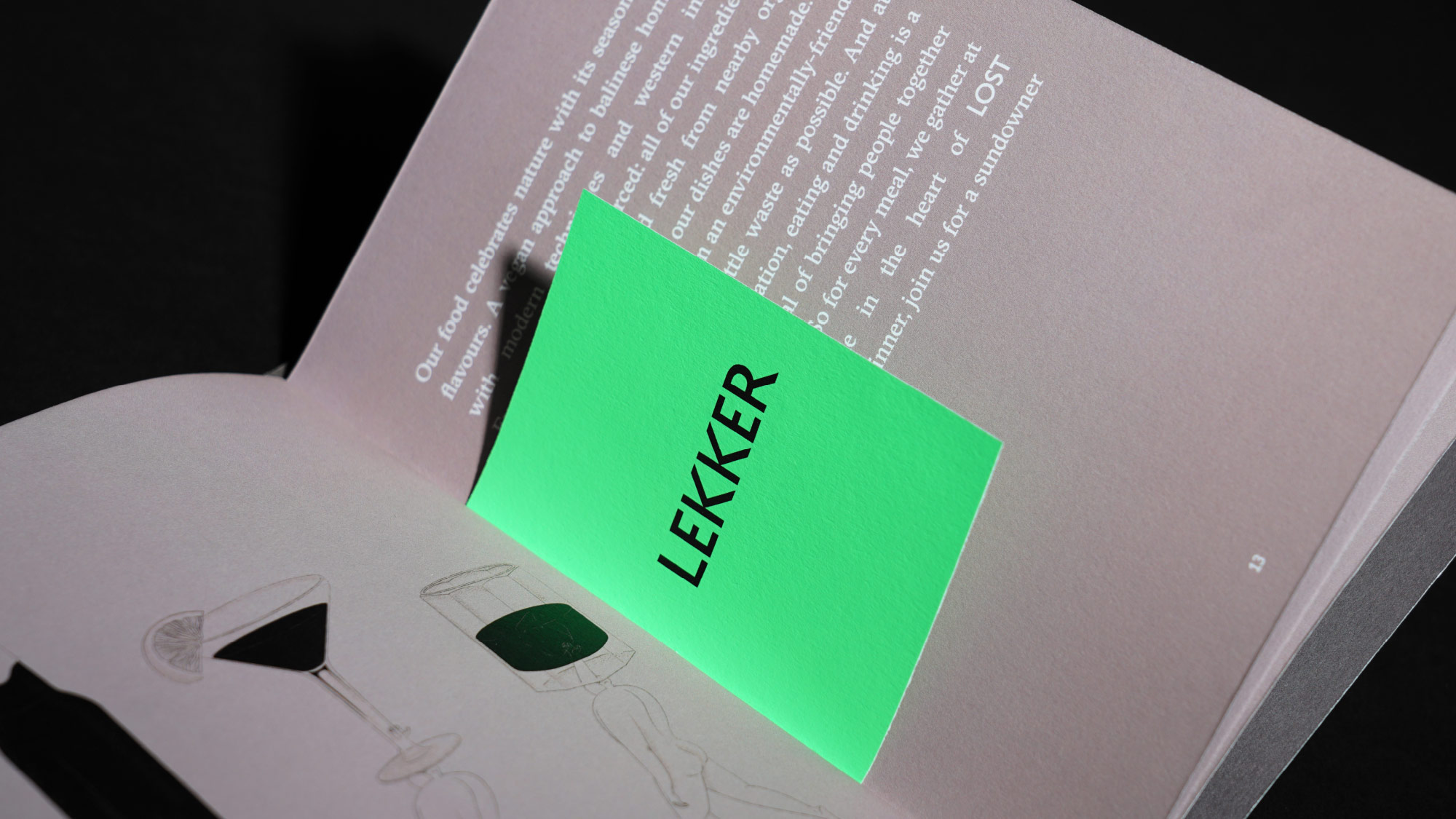
Drawing inspiration from the Lost Boys, we crafted identity design and print materials that depart from the conventional hospitality color palette. Neon hues were artfully juxtaposed with natural tones, making a bold statement of modernity and urban flair. This design mirrors the dual facets of the overall hotel experience, capturing both the lively and serene sides of Bali. The logo, designed for timelessness, features surfing Lost Boys in a mystical headstand, forming the shape of the letter 'L' for Lost. The tone of voice is characterized by straightforward and witty copywriting, seamlessly woven across various branding touchpoints in the hotel. By incorporating neon colors, we create a contrast different from typical hospitality branding. The color itself serves as a statement of contemporaneity, symbolizing urbanity. This paradox is also reflected in the hotel experience.
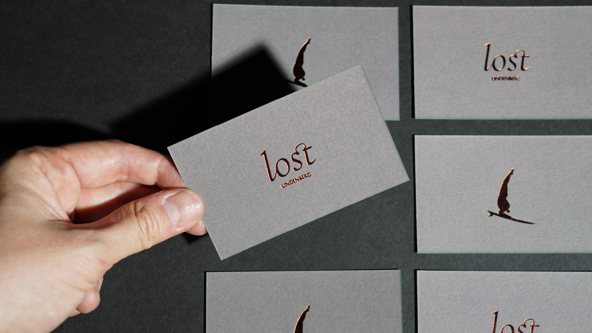
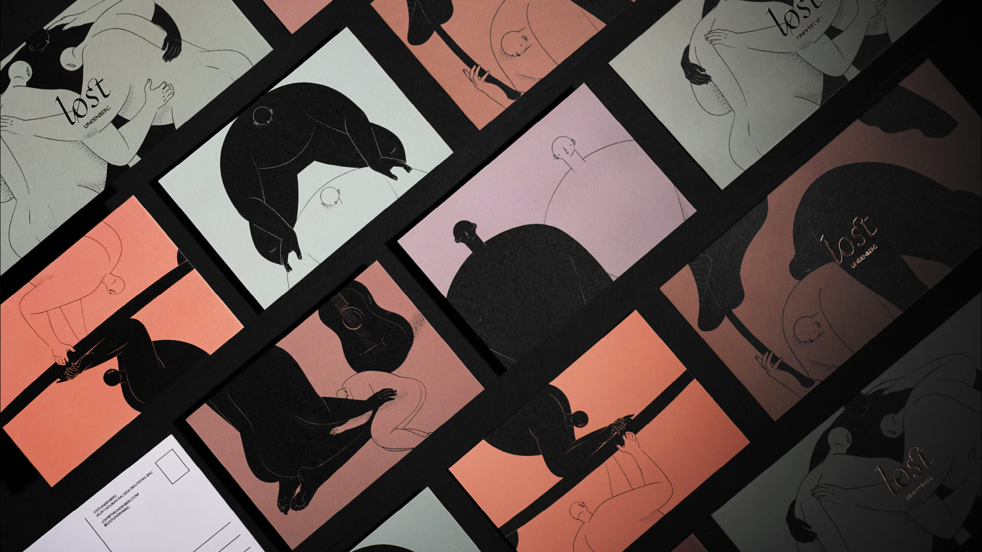
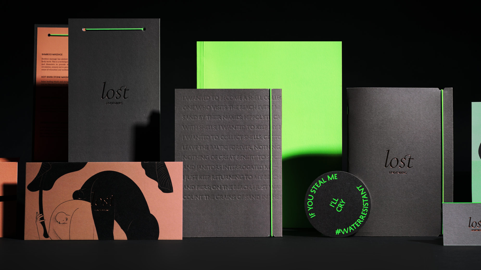
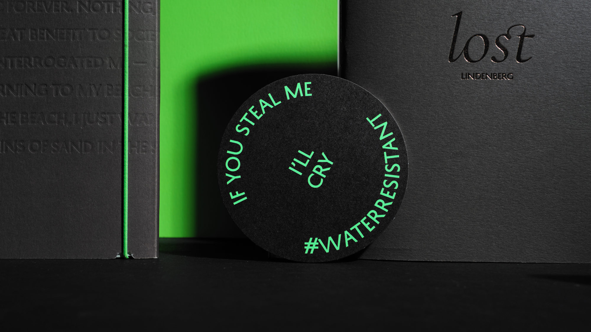
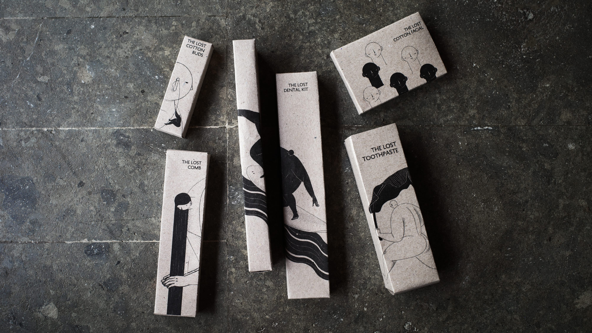
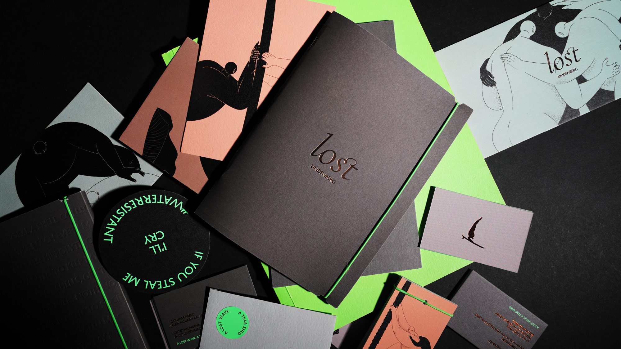
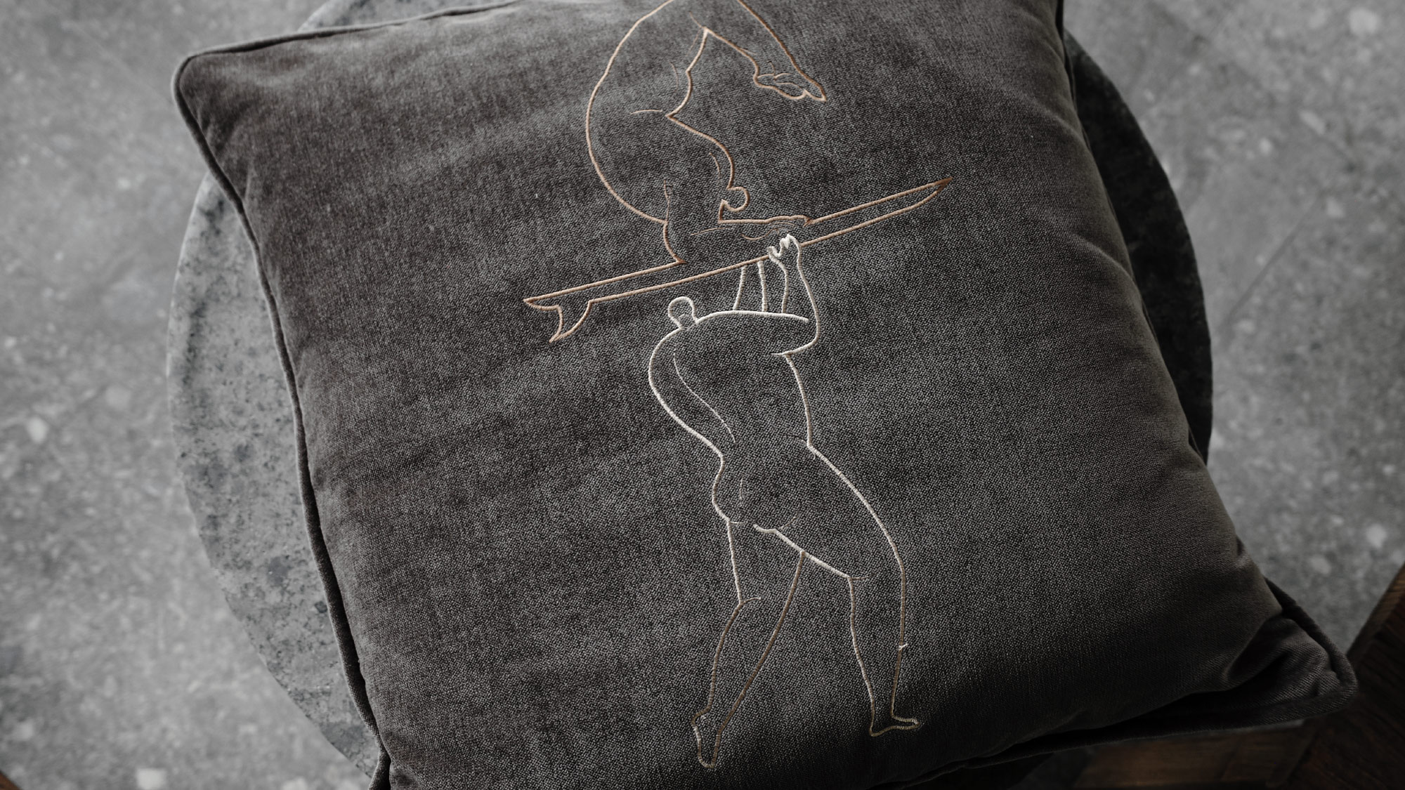

Throughout the hotel's touchpoints, we collaborated with brands such as Pyzel and other local artisans to ensure each printed material embodies the uniqueness of the Lost Boys concept. We chose sustainable materials for our prints, including ceramics from Gaya Ceramics for toiletries and more.

Books & Poetry
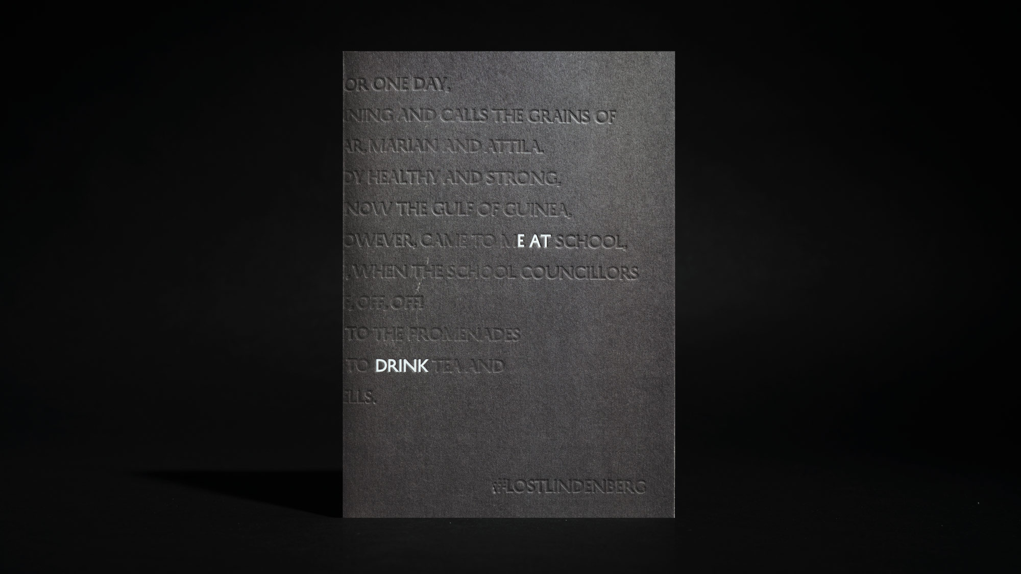
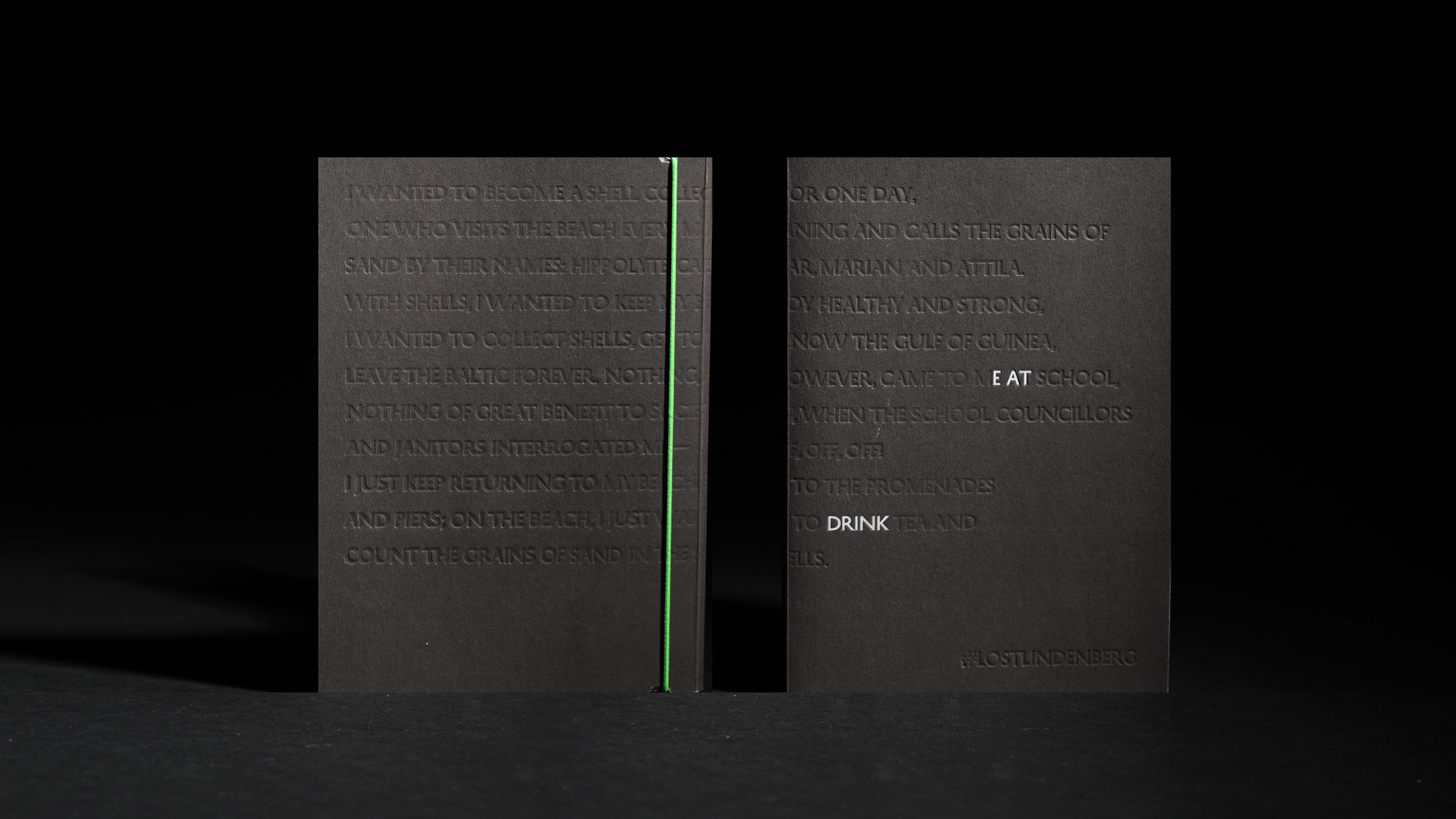
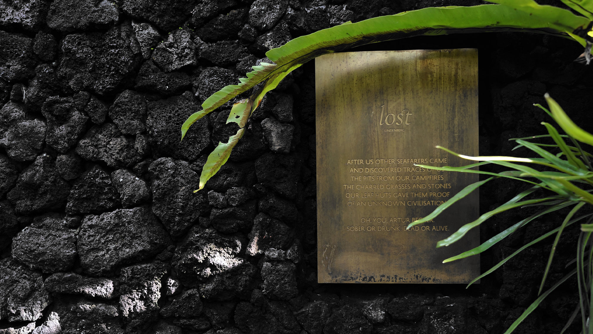
For books and printed materials, we worked with the German poetry artist Artur Becker to craft a poetic narrative inspired by the guests' journey at LOST. The poem is then delicately inscribed as subtle details in the books, collaterals, and wayfindings, containing clues and stories about LOST that also correlate with the room names and the overall experience in the hotel. Introducing poetry not only raises awareness but also allows us to work with multiple disciplines of art beyond the visual, demonstrating that words themselves can be an art form.

Getting Lost
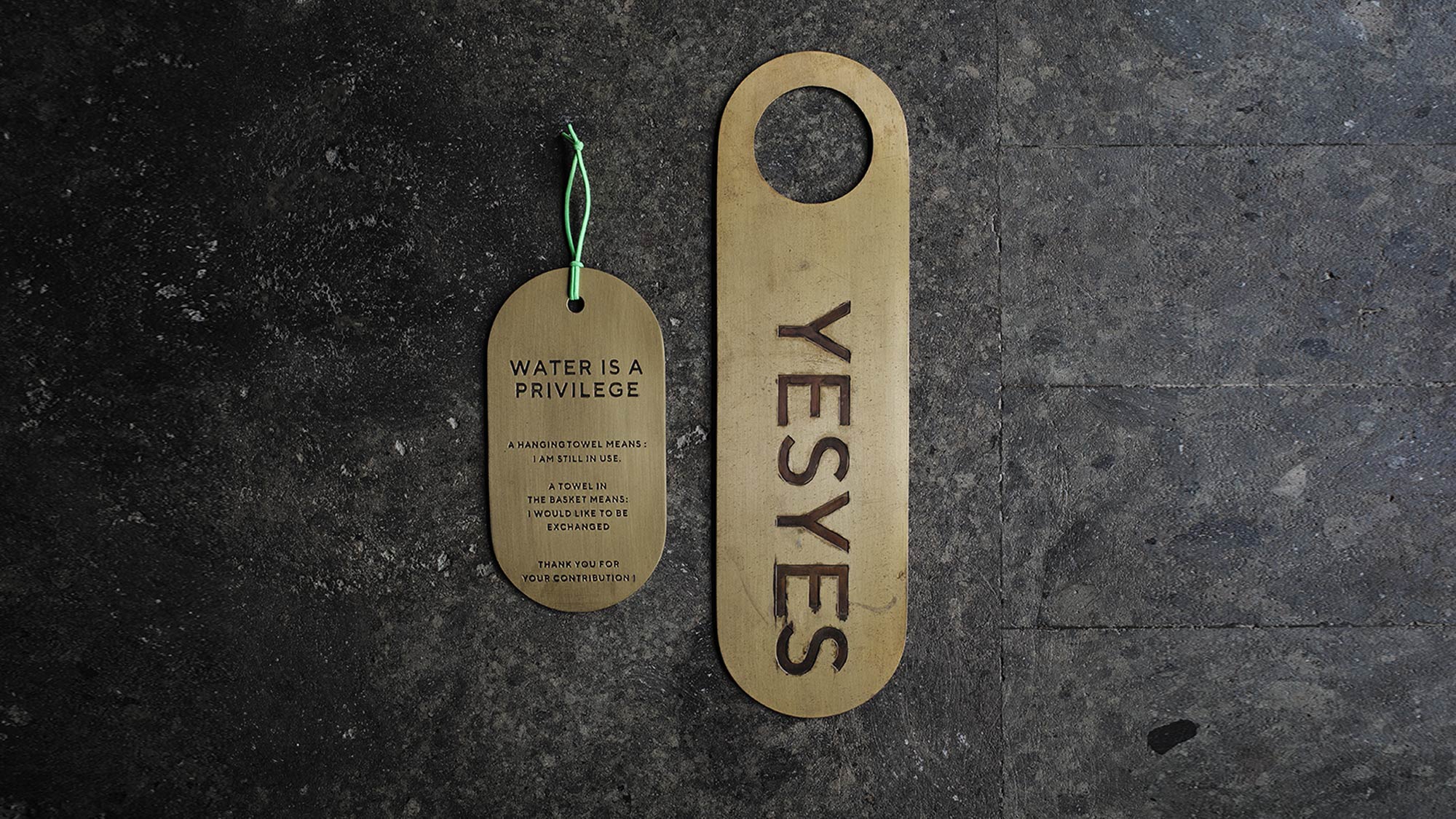
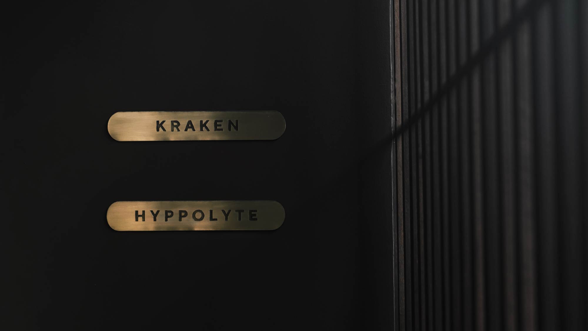
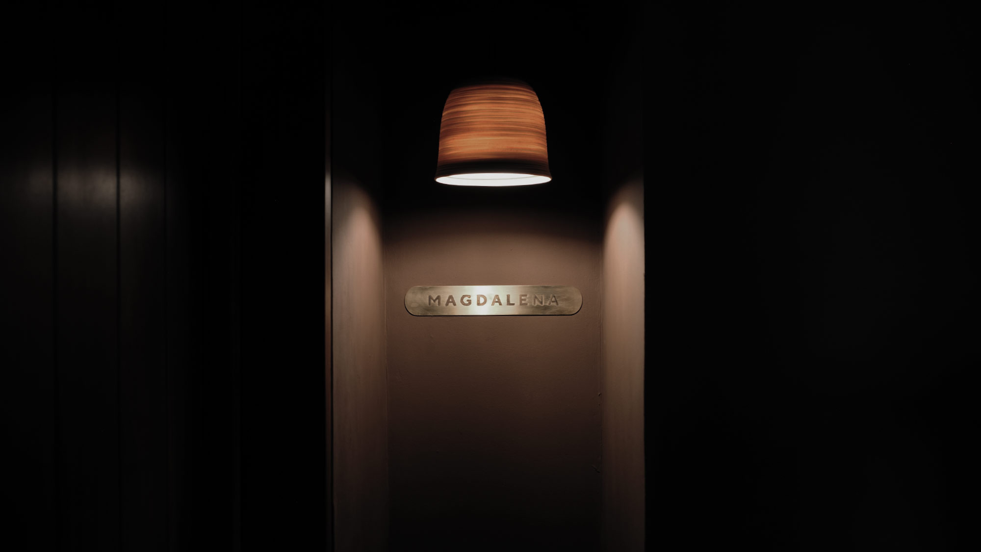
The LOST brand embraces a non-literal wayfinding system where getting lost is a crucial part of the journey. Navigating through the poetic verses of Artur Becker, guests discover clues in every corner. The LOST signage takes inspiration from ancient tablets, evoking a sense of antiquity. This aesthetic is enhanced by the use of carved bronze metal, imparting an artistic and artisanal touch. We extend this unique wayfinding approach to room names and all signs throughout the space.
Architecture
Alexis Dornier
Studio Jenquel
Construction
Bali Construction
Facade Artwork
Tobias Rehberger
Poetry
Artur Becker
Ceramics
Gaya Ceramics
Surfboard
Pyzel
Photography
Robert Reiger
Iker Zuniga (Pempki)
Prabowo Prajogio
Design Director
Evelina Kristanti
Creative Direction
Danis Sie
Illustration & Art Direction
Yosephine Azalia
Designer
Yosephine Azalia
Natasha Ng
Hanif Akhyar
