TÜR Coffee
Wake and Wander
TUR, translating as 'Door' in German, is a concept inspired by the art and science of cartography and map projection. With the narrative "Wake and Wander," the brand invites people to taste and wander through the best-curated exotic coffee. The brand embarks on an exploration of the "Coffee Belt" through a collection of exquisite cups. These coffees not only deliver the magical flavors of their terroirs but also establish a connection with the unique and diverse sociocultural elements of their origins.
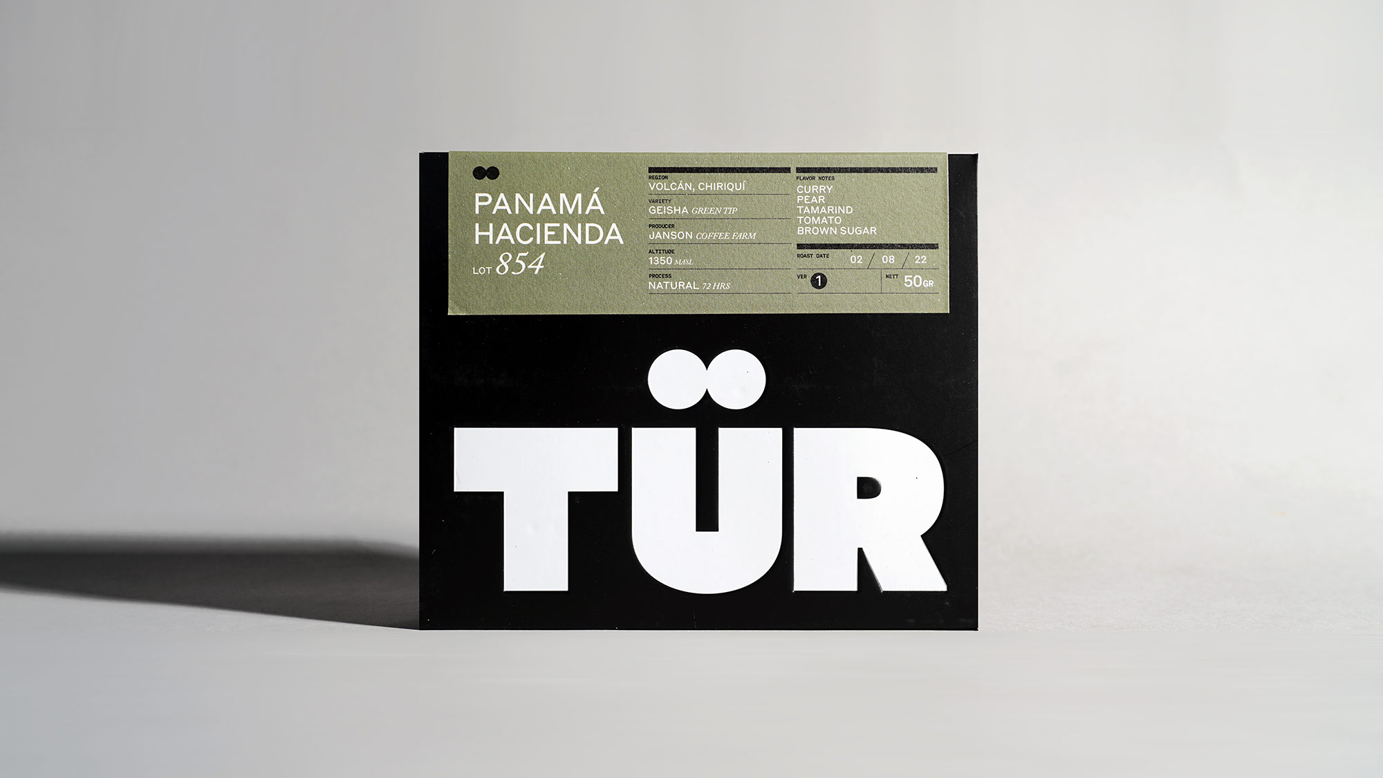
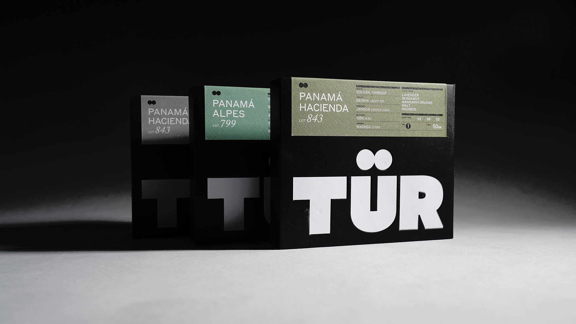
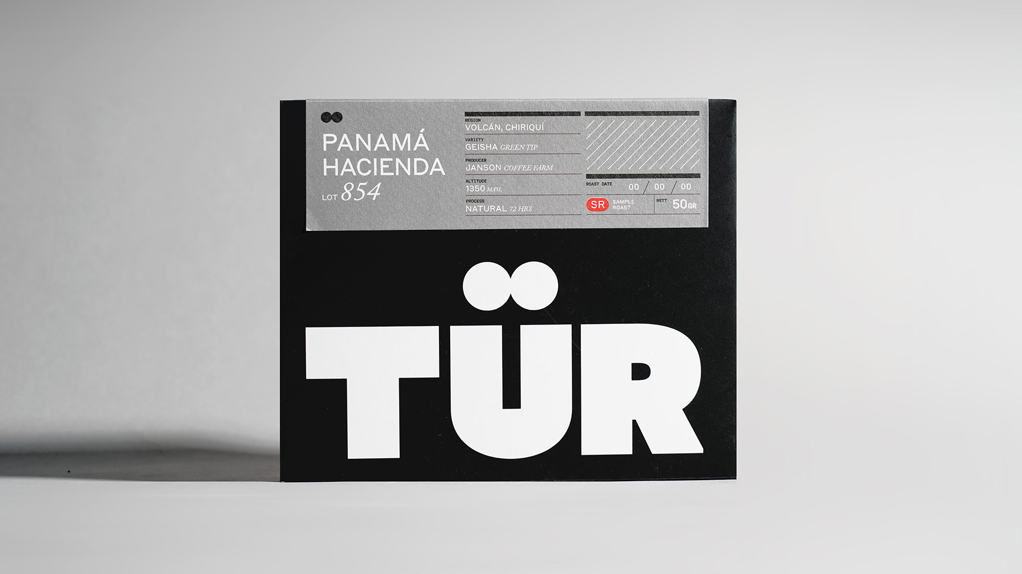
The packaging series incorporating color codes tied to specific regions, such as green shades for Panama and orange for Yemeni Beans. Notably, a special grey color (SR) is reserved for sample roasts, a unique edition not available for sale or an experimental roast. Looking ahead, each future release will introduce its own distinctive colors, allowing people to easily associate each hue with specific regions. This thoughtful color scheme adds a visual dimension to the coffee experience, creating a unique and memorable connection between our products and their origins.
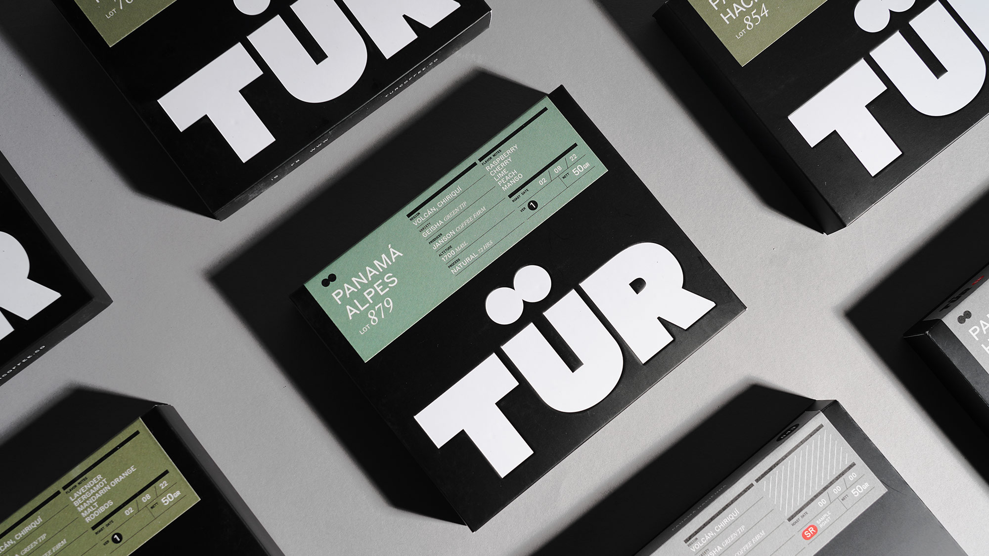

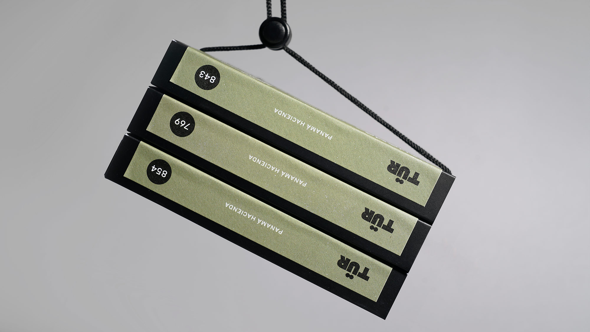
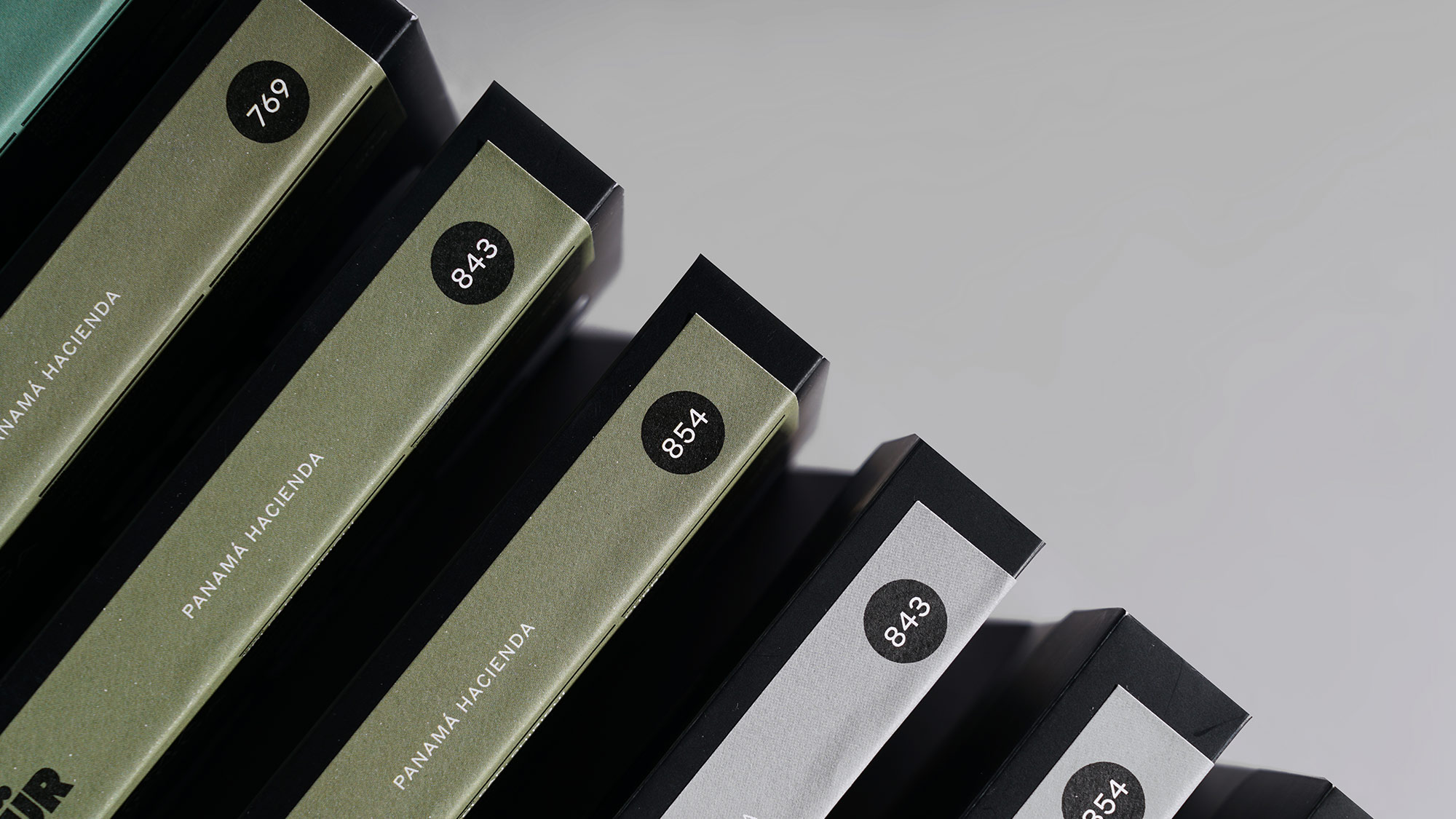
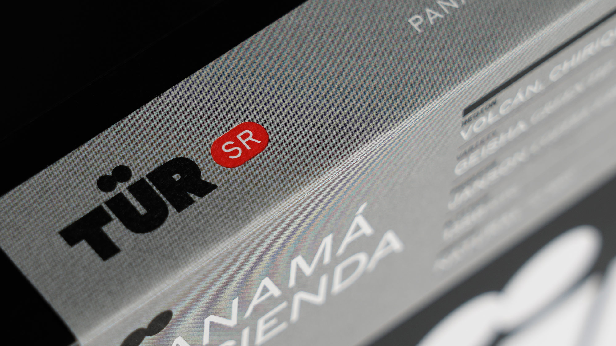
The first packaging design is deliberately kept simple, highlighting an embossed logo and providing clear details about the coffee lot. We've put thought into how the product will catch your eye when placed among others, aiming for a distinct and bold look. Unveiling the packaging reveals a map displaying the region where the coffee is sourced. Additionally, there's an information card inside, offering insights into how the coffee is sourced and sharing cultural tidbits about the coffee.

The Sensory Map
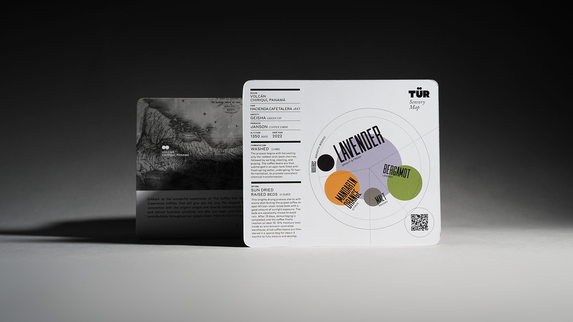
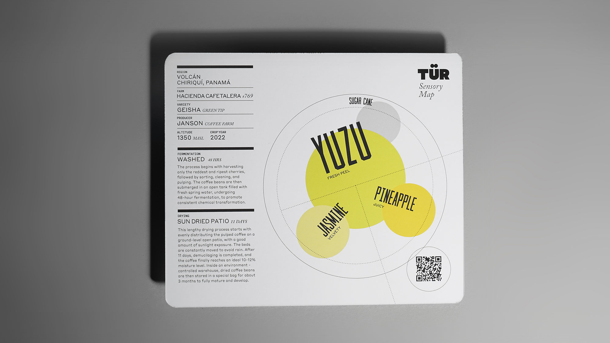
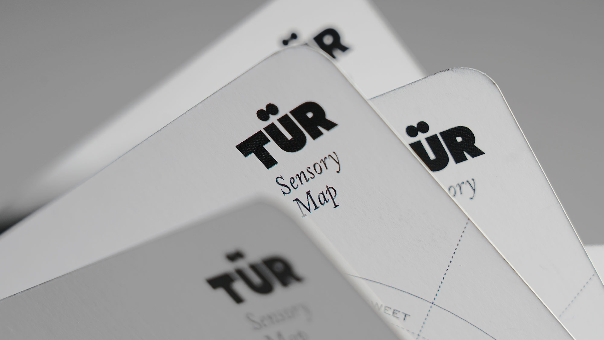
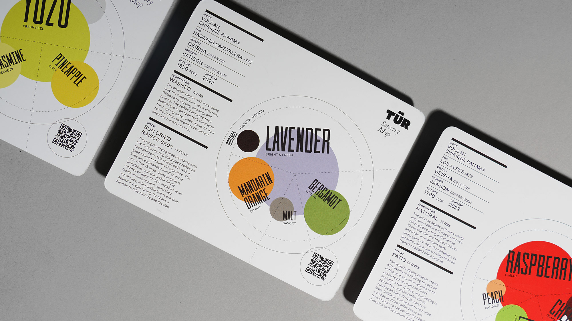
Each package includes an information card with in-depth stories about the beans, transparency information, and the "TÜR Sensory Map" crafted for each distinct set of taste notes. The sensory map card is designed to visually portray the flavor complexity of each coffee. The circular map and grid draw inspiration from the coffee flavor wheel, illustrating the first impression, aroma, flavor complexity, and aftertaste in a colorful, contemporary orbit.

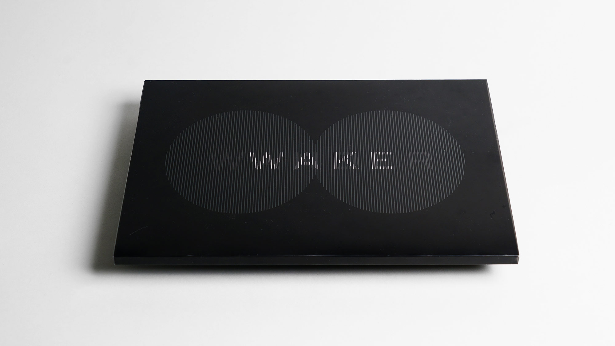
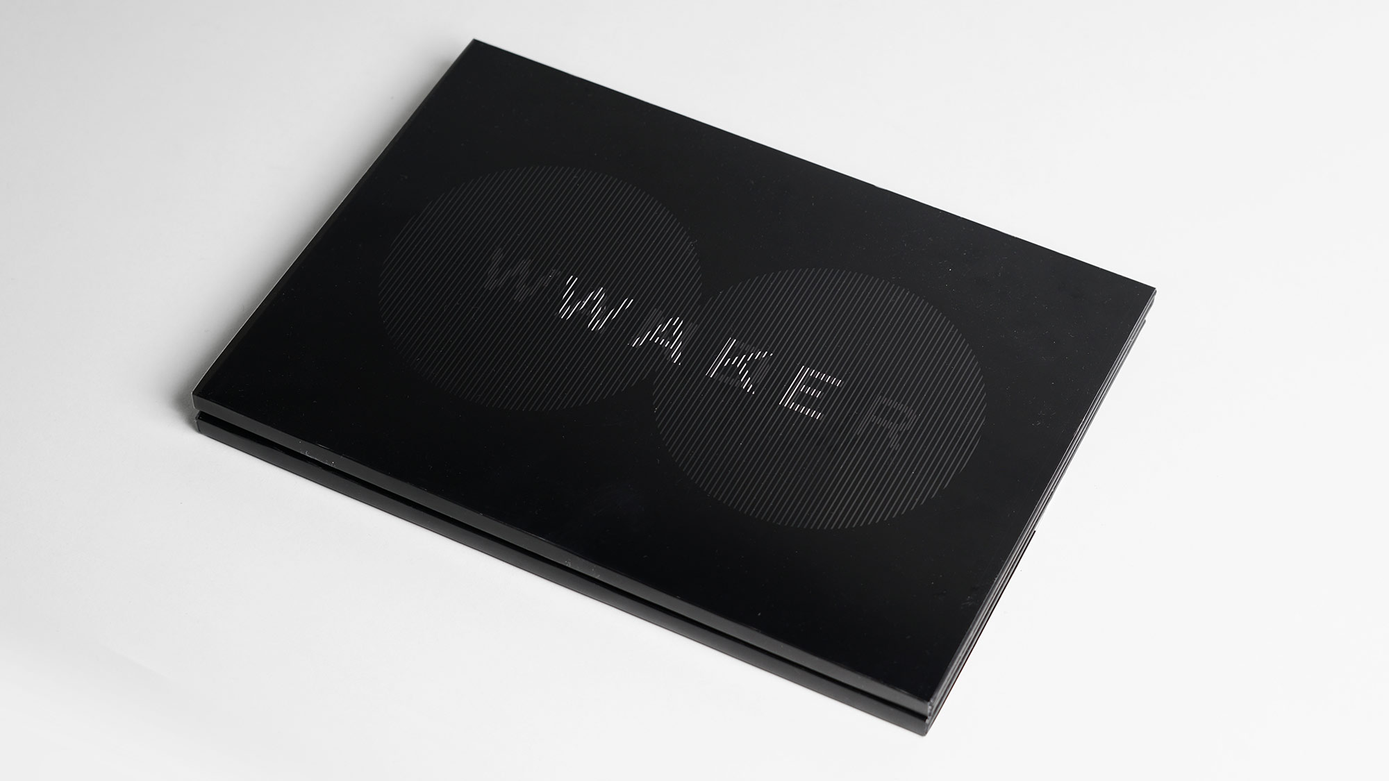
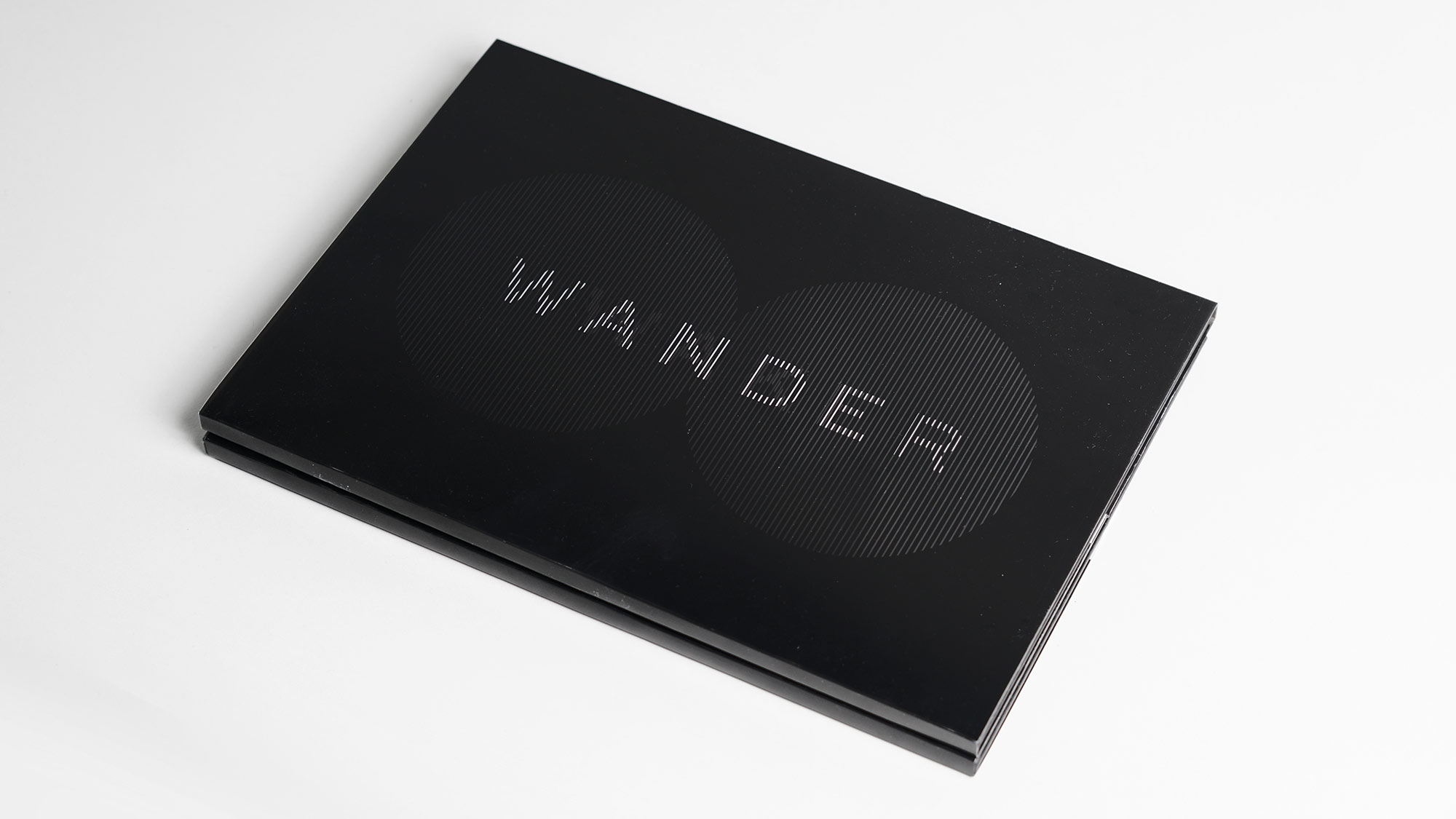
Wake and Wander Book
The Identity Guideline Book for TUR is a comprehensive document encompassing the overall direction, concept, and fundamental identity guidelines for the design. This guide serves as a valuable resource for ensuring consistency and coherence in TUR's visual representation. One notable aspect involves the experimentation with an ilusory motion effect applied to the TUR main icon.
Project Director
Evelina K
Creative & Art Direction
Danis Sie
Designer
Danis Sie
Amelia Lim
Copywriting
Andrew Sulisthio
